Use Contrasting Colors to Highlight Architectural Details in Your Woodwork


Use Contrasting Colors to Highlight Architectural Details in Your Woodwork
When you paint the woodwork on your home, it’s not just about protecting the surface from the elements—it’s also a chance to highlight your home’s architecture and give it personality. By using contrasting colors, you can create depth, emphasize details, and give your home a distinctive look that fits both its style and surroundings. Here’s how to use color intentionally when painting exterior woodwork.
Why Contrasting Colors Make a Difference
Contrasting colors bring life and balance to a home’s exterior. When you combine light and dark shades—or warm and cool tones—you draw attention to the lines and shapes that might otherwise blend into a single color field. This approach works beautifully on window trim, eaves, doors, railings, and fences.
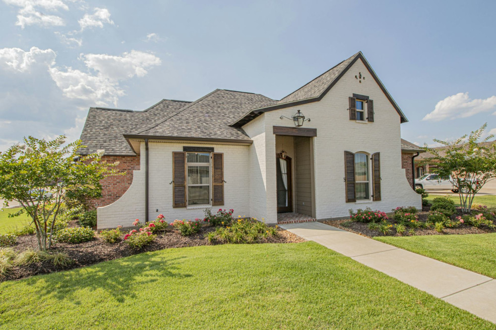
A classic example is a white house with black or dark gray window frames—a timeless combination that looks crisp and elegant. But contrast doesn’t have to be bold. Choosing a trim color just a few shades lighter or darker than the main color can create a subtle, harmonious effect that still adds visual interest.
Let Your Home’s Style Guide Your Color Choices
Before you pick up a paintbrush, take a moment to consider your home’s architectural style. Different styles call for different color treatments:
- Traditional homes with detailed trim and moldings often look best with light facades and darker accents that highlight craftsmanship.
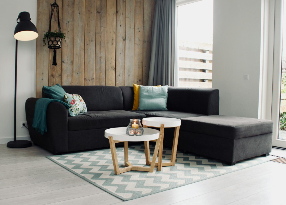
- Modern or mid-century homes with clean lines and large surfaces can handle strong, graphic contrasts—think black and white, or gray paired with natural wood tones.
- Farmhouses and cottages often suit more natural palettes, where contrast comes from pairing muted earth tones with lighter doors or window frames.
By respecting your home’s original design, you’ll achieve a result that feels both authentic and visually appealing.
How to Choose the Right Colors
Working with contrast is all about balance. Too much difference can feel harsh, while too little can disappear. Here are a few guidelines:
- Start with the main color. This will cover most of the woodwork—such as siding or paneling.
- Select a secondary color for details like windows, doors, and trim. It should be noticeably lighter or darker than the main color.
- Consider a third accent color for smaller elements like shutters, railings, or the mailbox. This adds personality without overwhelming the design.
Always test your colors directly on the house before committing. Natural light and surrounding elements—like landscaping or neighboring homes—can dramatically change how colors appear.
Use Contrast to Emphasize Details
Once you’ve chosen your palette, use it strategically to highlight architectural features:
- Windows and doors: A darker frame around a light surface makes openings stand out and adds definition.
- Eaves and cornices: A lighter color here can make the roofline appear lighter and more balanced.
- Trim and corners: Darker trim against a light facade can give structure and emphasize the home’s shape.
- Decks and fences: Repeating one of the house colors—or introducing a complementary contrast—can visually connect outdoor spaces to the main structure.
Even small adjustments in color placement can transform the overall look of your home, so take time to decide where you want the eye to go first.
Practical Considerations Before You Paint
Before you start painting, make sure the woodwork is in good condition. Clean surfaces thoroughly, remove any loose paint, and repair damaged areas. Use a quality primer, especially if you’re switching from dark to light colors.
Choose a high-quality exterior paint suited to your wood type and local climate. This ensures a more durable and attractive finish. Keep in mind that darker colors absorb more heat and can cause wood to expand and contract more—something to consider if your home gets a lot of direct sunlight.
Create a Cohesive Look
When working with contrasting colors, think about the entire property—not just the facade. The roof, foundation, windows, doors, fences, and even outbuildings should coordinate in a way that feels unified. This creates a polished, intentional appearance, even when you’re using bold contrasts.
A helpful trick is to repeat accent colors in small doses across different areas—for example, using the same dark tone on window frames, the front door, and the mailbox. This repetition ties everything together and makes the design feel cohesive.
A Personal Touch That Honors Your Home
Using contrasting colors isn’t about being flashy—it’s about finding the right balance between classic and personal. With thoughtful color choices, you can preserve your home’s character while giving it a fresh, modern edge.
So next time you pick up a paintbrush, think beyond protection. Consider how color can tell the story of your home—and make its architectural details truly shine.